Williams Peoplesoft - An Example of Bad Design
The Williams Peoplesoft can be very confusing for first-timers to use. Right after logging in, the front page is merely a blank, empty space, with absolutely no information or instructions on how to navigate it. Below is a snippet:

From a user standpoint, this is very difficult to use. Unfortunately, this is a widely-used website that all student use to change their classes at the beginning of semesters, to find out about exam schedule, to book bus schedule for vacations, and to find information about their academic records. Even though this website hosts many purposes, it barely indicates that on the front page.
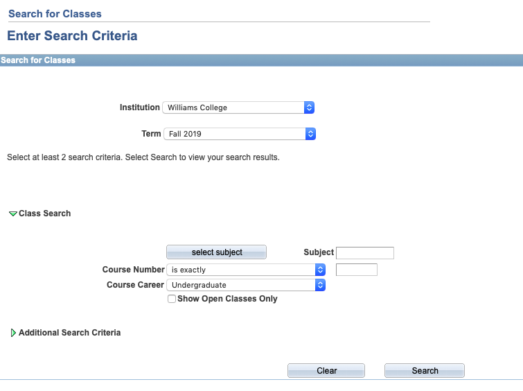
One of the many frustrating parts of this website is the Class Search Toolbar. The users can only type in the exact course numbers, or at least have to type in the correct prefix of the department. While registering for my freshman fall classes, I remembered feeling very annoyed at this feature, as I had to look up the prefix for Computer Science at Williams (CSCI), in order to search up classes.

Peoplesoft is clearly an example of a poorly-designed website, and could be improved much more to change the overall students’ experience