Design Manifesto
As another semester is coming to a close, I want to take a step back to reflect upon what I have learned in Human-Computer Interaction throughout. Although I myself am not an experienced designer, as this is the very first course I take about introduction to user experience design research, there are key points that I would like to emphasize upon as I maneuver my way through this complicated and multifaceted topic:
1. Design with a heart, not with just a head. (personal code of ethics)
It’s actually difficult to know whether one is designing with a heart or not. The data of the world that we’re living in is biased, so the information we concluded from these data is very likely to be biased. The responsibility of the designer in fact lies more beyond simply designing with a heart. A heart is not enough, as sometimes the designer would violate the code of ethics in programming without ever realizing it until the consequences came. One classic example we read in class is about how an algorithm that predict future criminals is biased against blacks as it’s likely to predict a black person as more prone to committing violent crimes in the future. I’m sure, COMPAS, the designer of this algorithm, has good intentions; they merely wanted to help the juries with their decisions by providing more helpful insights. However, the data collected for this algorithm is biased, yet they are unaware of the fact. This kind of example posts a challenge to our own design: Are we being impartial enough to all types of user? Are there any potential problems we forgot about that can arise when the product is actually in use?
When we were designing Clink!, we want our product to reach out to anyone who is interested in finding out about events and posting events online. As college students, our initial approach might have targeted more on students on campus and the people in the outside community. However, this project idea is more than just that: it can be any person with the neighborhood around them, and can potentially reach many and anyone. Thinking a little further ahead, how can we assure that, when our app is complete, our searching algorithm would provide good and “personalized” enough event suggestions? What if people of different backgrounds, despite having the same interests, are not interested in the same type of events? How would we prevent events that are toxic or dangerous from reaching and influencing the young users?
As I read more about ethics in computing, I realize the designer think not only on behalf of the engineers or the designers, but also on behalf of the user on every corner of the globe. Problems might sometimes be inevitable as there can be innumerable number of issues that can arise when cultures clash on a common product. However, as designer, we need to think broader, looking a step ahead into the issues that can potentially arise by looking at past issues, see how it can apply to the developing product, and project to fix these potential problems.
2. It’s tempting, but don’t jump straight into high-fidelity prototyping
Flashing back to September, when I showed up to my first HCI course, what I have in mind at the mind was already the final product. Sitting in the classroom, I would imagine some product I have already created out there, already in use and widely loved by the public. Before taking the class, I was imagining a course about user-experience design would be designing an interface, however I like it, and I was so excited by the idea. Only when I started diving into the course did I know every design started with a tedious process, from discovering about all sort of user learning methods such as Fly on the wall, Contextual Inquiry, interviewing, to learning about the most basic ways to put our idea onto paper, from task analysis to storyboards to paper prototyping. Every step of the way the universal questions are pitched again and again: What points are worth pursuing in this design idea? Who exactly are we designing for? Are we actually helping our users solve their problems?
When we first started with Clink!, the project was merely about helping people find events easier. Yet as we went through the process of doing contextual inquiries with people who helped planning events, and layout the affinity diagramming, we learned more about how we should approach this problem, and posted smarter questions to our design process: Why aren’t people finding events easy enough? Which part of finding events/ broadcasting events do we want to fix that current apps aren’t currently doing? Only when your design goes through all of these kinds of trial questions do you actually put your idea into a prototype, and show it to others. Otherwise it would be a waste of time, because you’ll have to redesign everything again.
3. Approach your design from multiple view points
After doing contextual inquiries and drawing out project ideations and storyboards, it becomes easy to say: Based on these information, let’s think further about how we can approach our design. But how? How do we bring all these information we learned from our research, and gather them into a cohesive whole?
Again, these are questions that I, myself, as a user, never have to think about. In user experience design research, we learned how to pitch tasks that we want the user to be able to do (task analysis). I also learned that one way to give the design team a feel that they are designing for a user, is to create user personas and scenarios, and create storyboards out of them. At the early stage of designing, creating a fictionalize user can be beneficial, as mentioned in John Pruitt’s Personas: Practice and Theory, personas can “generate a momentum” that increate user focus and awareness. For Clink!, our group came up with scenarios of old people who are not technologically savvy, but would love to know about events that are happening close to them, or a persona of a college student who has an event to broadcast and would love to invite some friends over, but the current college bulletin board is not efficient enough to get news about their event across. These become the kind of “users” that we target our design to, and Clink! works towards satisfying their needs in the most sufficient way.
When trying to come up with a design for Clink!, I realized how easy it is to get carried away by just targeting the design for one user, one problem. However, there are multiple types of users who might be targeting our product and might use them for different purpose, so it is essential to think about as many scenarios as possible, and strive to fulfill as many tasks as possible.
4. Accessibility in design is core
Due to time constraint, our paper prototyped was tested with 3 students at Williams, despite its potential to reach out to many more types of user. Theofanos’s paper, Observing users who work with screen readers, sheds a lot of light on how we, as app designers, are taking for granted a lot of app functionality that might not be accessible to other types of user. The paper talks a lot about how certain web elements make it more difficult for people with sight disabilities to navigate through. A small in-class activity we did also made me think about how we should design app that is truly accessible to all.
While designing the two tasks for Clink!, and the overall website, we made sure that every detail is coherent and clear enough for the people with disabilities such as color-blindness and vision disability can still easily navigate. Our website has clear color distinctions, and minimalistic information, yet still convey the necessary information. All the demonstrated pictures have alt text. Despite all that efforts, we could still be missing some important features that could be helpful to some user.
Looking beyond the HCI course to future product developing, it’s easy to get lost into the context of designing for the users that you think you’re designing for, without taking into account others potential user. One good example is the disadvantage of creating a persona, despite all the good benefits it brings in pinpointing the necessary design features. Persona can make the designer get lost into just designing for that fictionalized character alone, and that “person” is not representative of the whole population. Indeed, I learned that while focusing on one goal of user-centered design, it’s very easy to forget about others.
5. It’s impossible to satisfy every user. Still, retest, retest, retest.
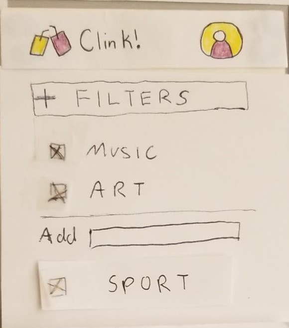
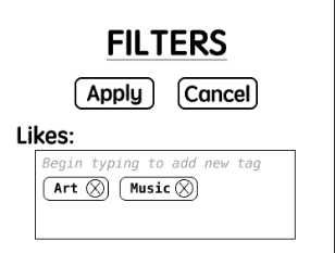
When we first developed our paper prototype, we have done all sort of testing and checking: from affinity diagram to task analysis, even to the heuristic evaluation in class when other students pointed out the possible issues with the current prototype. Before the usability testing, I thought that the user would of course have no issue while using our product, we have put so much thought into every piece already. For Clink!, we originally designed our filter feature as a drop down button so that it’s easier for the user to click on and check in boxes that match their interests. However during our heuristic evaluation in class, a user expresses that they wish they could explicitly type in what they want without the constraints and limitations of check boxes. As a result, we redesigned our prototype so that the filter page is representative of this idea: text boxes so the user can type in, with multiple areas that they can filter on. However, as we carried out the usability testing, another user expresses that they don’t like having to type and hoping they can have simple check boxes instead. We also had issues when different user testers gave different opinions about where they expect the recommendation feature to be, one said it should be in the profile page, and one said they would expect it to be in the menu bar (which is how it is currently designed).

Our filter feature before usability testing.

Our filter feature after usability testing.
In real usability testing, the team would have to test their product with hundreds of user testers, and that would bring about thousands of different ideas. I realize that maybe we wouldn’t have to redesign our prototype according to everyone’s wish, because that would be impossible. However, in order to know what everyone thinks, we would still need to do a lot more usability testing. For Clink!, we only had the chance to do 3 usability testing. If we could have done more, we would have been able to collect more data and find out the general trend of the user before setting out to correct out prototype. Even though we cannot fulfill everyone’s wish, we can definitely try to combine them together in a way that makes sense. For example, we tried to design Clink! filter feature such that the user only have to type the first several words, then the suggestion boxes will appear, guessing what they meant to type in. That way, the final prototype would be able to meet the “needs” of many users.